In an effort to improve my R skills, I’m practicing on some Tidy Tuesday data! I am using Diwali Sales data this time around, which I think will be interesting to map out. Here is some information about where the data for this week comes from:
“The data this week comes from sales data for a retail store during the Diwali festival period in India.”
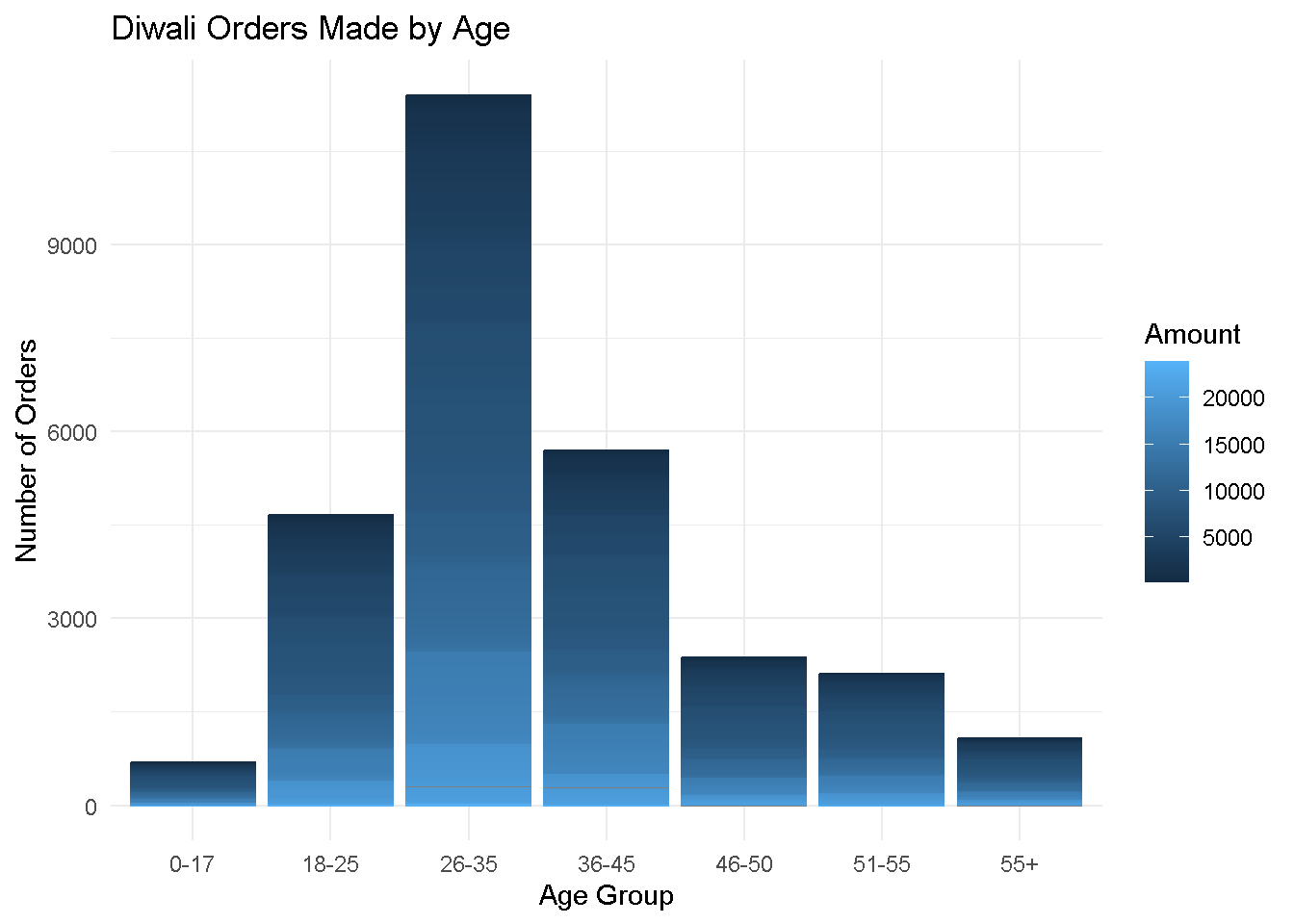
Below, you will find a plot showcasing the number of purchases for different age groups during Diwali, the festival of lights. The color gradient shows the amount in Indian rupees spent by each customer, revealing how age group impacts total rupees spent with respect to total orders made.
library(tidyverse)library(dplyr)library(httr2)house <- readr::read_csv('https://raw.githubusercontent.com/rfordatascience/tidytuesday/master/data/2023/2023-11-14/diwali_sales_data.csv')# Retrieving variables of interstcolnames(house)age_group <- house$`Age Group`Orders <- house$OrdersAmount <- house$Amount# plotting amount spent by age group with gg plotggplot(data = house, aes(x =`Age Group`, y = Orders, color = Amount)) +geom_col() +labs(x ="Age Group",y ="Number of Orders",title ="Diwali Orders Made by Age" ) +theme_minimal()